Exploratory data analysis
It is important prior to starting any analysis to inspect data This can be done to check for any departures from normality or any existing trend. Principle plots like histogram, boxplots and measures of central tendency and dispersion can help detect distributions of data that deviates from the normal. In additions maps can aid illustrate any spatial trends.
Data
We will mostly use the meuse dataset available in sp package. The meuse data set provided by package sp is a data set comprising of four heavy metals measured in the top soil in a flood plain along the river Meuse, along with a handful of covariates. The process governing heavy metal distribution seems that polluted sediment is carried by the river, and mostly deposited close to the river bank, and areas with low elevation. This document shows a Geostatistical analysis of this data set. The data set was introduced by Burrough and McDonnell, 1998.
rm(list=ls(all=TRUE)) # Clear memory
#Load existing/install missing libraries
if (!require("pacman")) install.packages("pacman")
pacman::p_load(gstat,sp)
data(meuse)
df <- meuse
knitr::kable(head(df, n=3), align = 'l')| x | y | cadmium | copper | lead | zinc | elev | dist | om | ffreq | soil | lime | landuse | dist.m |
|---|---|---|---|---|---|---|---|---|---|---|---|---|---|
| 181072 | 333611 | 11.7 | 85 | 299 | 1022 | 7.909 | 0.0013580 | 13.6 | 1 | 1 | 1 | Ah | 50 |
| 181025 | 333558 | 8.6 | 81 | 277 | 1141 | 6.983 | 0.0122243 | 14.0 | 1 | 1 | 1 | Ah | 30 |
| 181165 | 333537 | 6.5 | 68 | 199 | 640 | 7.800 | 0.1030290 | 13.0 | 1 | 1 | 1 | Ah | 150 |
OUTLIER DETECTION
Values with NA (Not Applicable) are removed from any further analysis. To detect outliers, boxplot.stats()$out function is used. It is based on Tukey’s method designed to identify outliers and missing data above and below the 1.5 times the Inter Quartile Range (IQR). The IQR gives a statistical way to identify where the bulk of the statistical data points (the middle 50%) sit in the range, and how spread out that middle 50% is. Normally a range between the 1st quartile and 3rd quartie is used. However, using the IQR range would aggressively tag too many values as outliers. So Tukey established a 1.5 basis, stating that the IQR should be multiplied by 1.5. The designed function (Getoutlier), shows the percentage (%) and mean of outliers in a dataset. The mean of data with and without outliers is also illustrated by the function. The box-plot and histogram are used to best illustrate the outliers. In the function, the data with and without the outliers are plotted. Finally, with help from interactive input (yes/no) the outliers are kept or removed from data. If the answer is yes then outliers will be replaced with NA. Outliers is a result of several causes i.e. data entry error, equipment error, or some other random variation of factors. Instead of removing them, it’s best practice is to investigate why they exist, where they came from, and what they mean to the analysis. Common practice is to replace them with mean or median of data or at times replicate of neighbouring values in spatial analysis. In this excersis we choose to replace them with median of the original data. Median is preferred to mean because it is established that its a robust estimate of the mean. However, with deeper understanding of sampling framework, equioment used, working conditions etc, other methods are possible like use of regression etc.
Data <- meuse
Getoutlier   <- function(dt, var) {
  var_name   <- eval(substitute(var),eval(dt))
    originalData <- var_name
  na1   <- sum(is.na(var_name))         #count Not Available (missing values) values
  md1   <- median(var_name, na.rm = T)  #Find median without NA values
    m1      <- mean(var_name, na.rm = T)    #Find median without NA values
    #windows() #prepare plot envirnment
  par(mfrow=c(2, 2), mai=c(1,1,0.25,0.25), oma=c(0,0,3,0))
    #layout(matrix(c(1,1,1,1), nrow = 4, ncol = 1, byrow = TRUE),widths=c(3,1), heights=c(1,2) )
  boxplot(var_name, main="With outliers")   #Plot boxplot of data with outliers
  hist(var_name, main="With outliers", xlab=deparse(substitute(var)), ylab="Frequency") #Plot histogram of data with outliers
  #Data points which lie beyond the extremes of the whiskers
  outlier <- boxplot.stats(var_name)$out
  mo <- mean(outlier)       #mean of outliers
  #Replace outliers by NA of dataset using matching %in% test for ease of counting
  new_NA <- ifelse(var_name %in% outlier, NA, var_name)
    na2 <- sum(is.na(new_NA))   #Count the new number of NA
    var_name <- ifelse(var_name %in% outlier, md1, var_name) #Replace outliers by median
  boxplot(var_name, main="Without outliers")    #Boxplot without outliers
  hist(var_name, main="Without outliers", xlab=deparse(substitute(var)), ylab="Frequency") #Histogram without outliers
  title("Outlier Check", outer=TRUE)
  #Print identified number of outliers similar to print(paste("Outliers identified:", na2 - na1, "n"))
  cat("Outliers identified:", na2 - na1, "numbers", "\n")
  # compute the proportion of outliers in data rounded to 1 decimal place
  cat("Propotion (%) of outliers:", round((na2 - na1) / sum(!is.na(var_name))*100, 1), "\n")
  cat("Mean of the outliers:", round(mo, 2), "\n")
  m2    <- mean(var_name, na.rm = T)    #Mean after removing outliers
    md2 <- median(var_name, na.rm = T)  #Median after removing outliers
  cat("Mean without removing outliers:", round(m1, 2), "\n")
  cat("Mean if we remove outliers:", round(m2, 2), "\n")
    cat("Median without removing outliers:", round(md1, 2), "\n")
  cat("Median if we remove outliers:", round(md2, 2), "\n")
  #response <- readline(prompt="Do you want to remove outliers and to replace with  data mean? [yes/no]: ") #Interactive input
    response <- "y"
    if(response == "y" | response == "yes"){
        #originalData <- na.omit(originalData) #remove missing /not applicable values
    #replace outliers with mean
        CleanData <- ifelse(originalData %in% outlier, md1, originalData)
        CleanData[is.na(CleanData)] <- md1  #Replace all missing values with 0
        cat("Outliers successfully replaced with median ", na2 - na1, "\n")
        cat("Missing data successfully replaced with median ", na1, "\n")
        write.csv(CleanData, "CleanedData.csv")
        return(invisible(CleanData))
     }
     if(response == "n" | response == "no"){
        cat(na2 - na1, " outliers retained", "\n")
        write.csv(originalData, "CleanedData.csv")
        return(invisible(originalData))
     }
}
CleanData     <- Data #create another variable to hold cleaned data
CleanData$om    <- Getoutlier(Data, om) # remove outliers from organic matter (OM)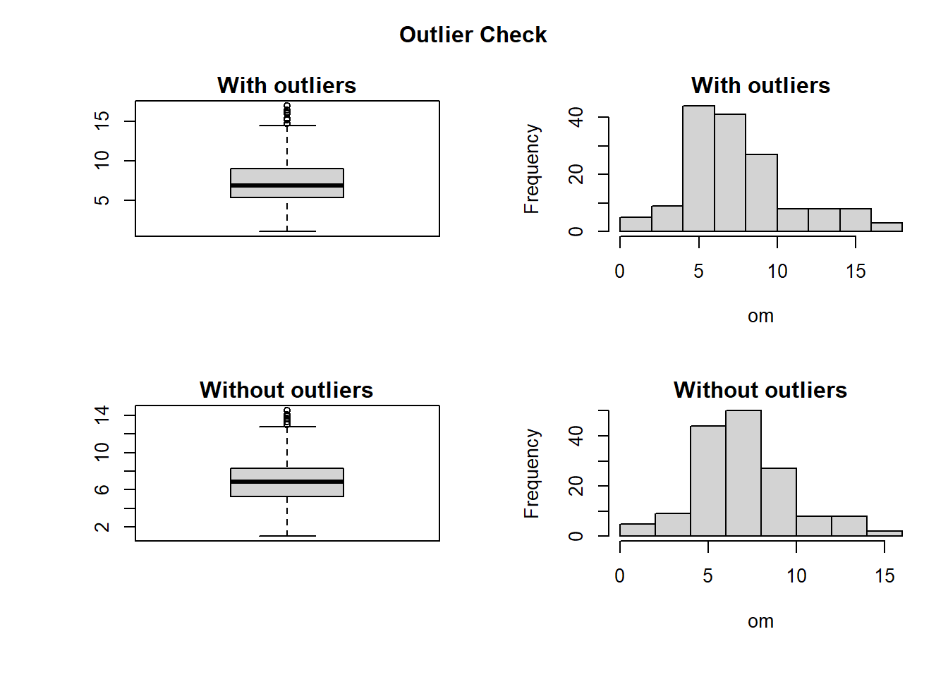
## Outliers identified: 9 numbers
## Propotion (%) of outliers: 5.9
## Mean of the outliers: 15.77
## Mean without removing outliers: 7.48
## Mean if we remove outliers: 6.96
## Median without removing outliers: 6.9
## Median if we remove outliers: 6.9
## Outliers successfully replaced with median  9
## Missing data successfully replaced with median  2
Measures of Cental Tendency
Measures of of center of tendency include: mean. median and mode. For example, using the topsoil copper concentration data in Meuses dataset these measures can be computed as follows in R.
Mean and Median
See below.
vMean   <- mean(df$copper)
cat("The mean is ", vMean)
## The mean is 40.31613vMedian <- median(df$copper)
cat("The median is ", vMedian)## The median is 31Mode
There are several ways of finding the mode. We will illustrate here using a designed function and an inbuilt function in modeest library.
pacman::p_load(modeest)
attach(df)
getmode <- function(x) {
  ux <- unique(x)
  ux[which.max(tabulate(match(x, ux)))]
}
vMode <- getmode(copper)
cat("The mode using the designed function is ", vMode)
## The mode using the designed function is 22vMode <- mlv(copper, method = "mfv")
str(vMode) #Chec structure## num 22typeof(vMode) #Check variable type## [1] "double"cat("The mode using modeest package is ", vMode)## The mode using modeest package is 22Measures of Dispersion
Measures of dispersion include: variance, standard deviation, kurtosis, coefficient of variation and kurtosis. To illustrate this we still use meuse data in sp package.
Variance and standard deviation
data(meuse)
attach(meuse)
#compute variance of copper
var(copper)
## [1] 560.763#Standard deviation of copper
sd(copper)## [1] 23.68044#Or You can compare the two approaches as below:
sd(copper)==sqrt(var(copper))## [1] TRUECovariance and correlation
Covariance and correlation are used to illustrate joint dispersion of two variables. Using the same dataset, we can compute the covariance and correlation of copper and lead as follows:
rm(list=ls(all=TRUE))
if (!require("pacman")) install.packages("pacman")
pacman::p_load(sp)
data(meuse)
attach(meuse)
## The following objects are masked from meuse (pos = 3):
##
## cadmium, copper, dist, dist.m, elev, ffreq, landuse, lead, lime,
## om, soil, x, y, zinc## The following objects are masked from df:
##
## cadmium, copper, dist, dist.m, elev, ffreq, landuse, lead, lime,
## om, soil, x, y, zinccov(copper, lead)## [1] 2157.145cor(copper,lead, method = "pearson")## [1] 0.8183069Kurtosis and skewness
Intuitively, the kurtosis describes the tail shape of the data distribution. The normal distribution has zero kurtosis and thus the standard tail shape. For instance the copper data is more peaked than the normal distribution since the kurtosis > 0. This is also illustrated by a histogram plot overlaid with the normal distribution curve.
On the other hand, skewness is a measure of symmetry. As a rule, negative skewness indicates that the mean of the data values is less than the median, and the data distribution is left-skewed. Positive skewness would indicate that the mean of the data values is larger than the median, and the data distribution is right-skewed.
pacman::p_load(e1071)
kurtosis(copper)
## [1] 1.22259hist(copper, prob=TRUE,breaks=20,main="Normal distribution curve over histogram", xlab= "Copper")
curve(dnorm(x, mean=mean(copper), sd=sd(copper)), add=TRUE)
abline(v=mean(copper), col="red")
text(mean(copper),0.04,"Mean", col = "red", adj = c(0, -.1))
abline(v=median(copper), col="blue")
text(median(copper),0.04,"Median", col = "blue", adj = c(1, -.1))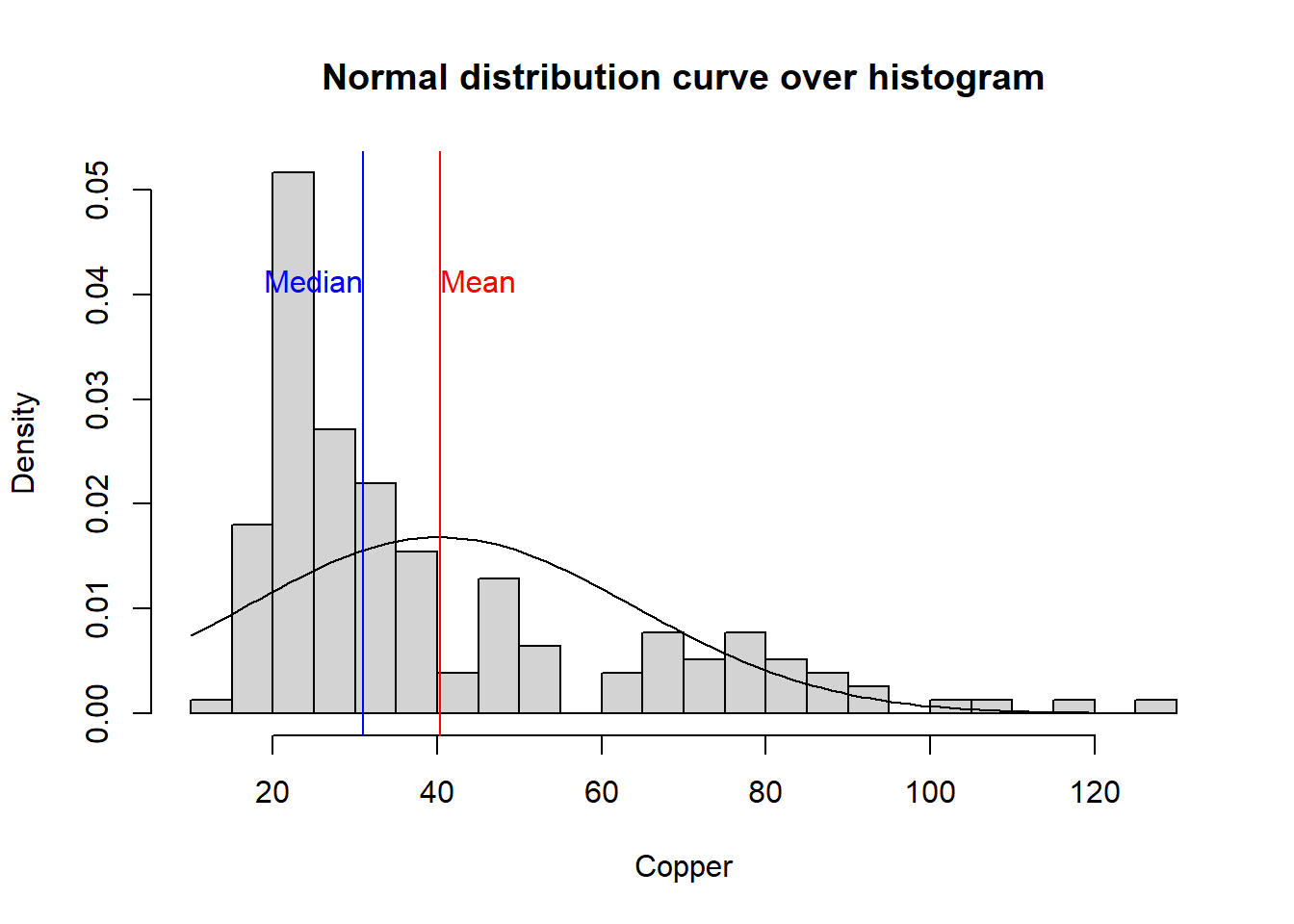
cat("Skewness of copper is ", skewness(copper), " . This means that the data is positively skewed as illustrated on the histogram plot.")## Skewness of copper is 1.386803 . This means that the data is positively skewed as illustrated on the histogram plot.Exercise
Compute the coefficient of variation in R.
Normal Distribution
Here we illustrate how normal distribution looks like. In R you can generate a the normal distribution using a specified mean and standard deviation.
x<-rnorm(100000,mean=10, sd=2)
hist(x,breaks=150,xlim=c(0,20),freq=FALSE)
abline(v=10, lwd=5)
abline(v=c(4,6,8,12,14,16), lwd=3,lty=3)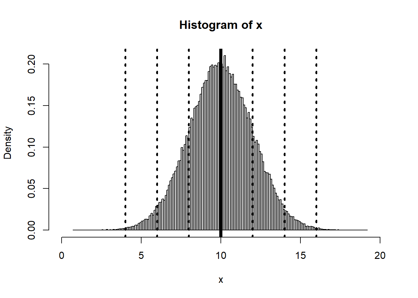
# Create a sequence of numbers between -10 and 10 incrementing by 0.2.
x <- seq(-10,10,by = .2)
# Choose the mean as 2.5 and standard deviation as 2.
y <- pnorm(x, mean = 2.5, sd = 2)
# Plot the graph.
plot(x,y)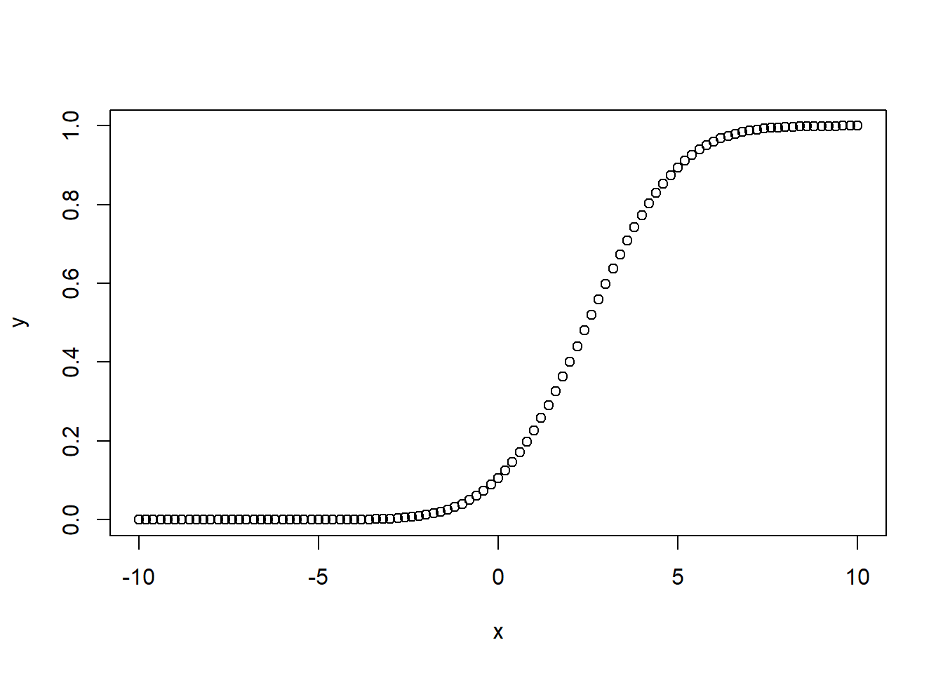
In R you can also check the distribution of data versus the Theoretical quantile distribution using QQ plots. It is possible To compare a sample with a theoretical sample that comes from a certain distribution (for example, the normal distribution).
To make a QQ plot this way, R has the special qqnorm() function. As the name implies, this function plots your sample against a normal distribution. You simply give the sample you want to plot as a first argument and add any graphical parameters you like.
R then creates a sample with values coming from the standard normal distribution, or a normal distribution with a mean of zero and a standard deviation of one. With this second sample, R creates the QQ plot as explained before.
qqnorm(copper, main='Copper in Meuse River')
qqline(copper)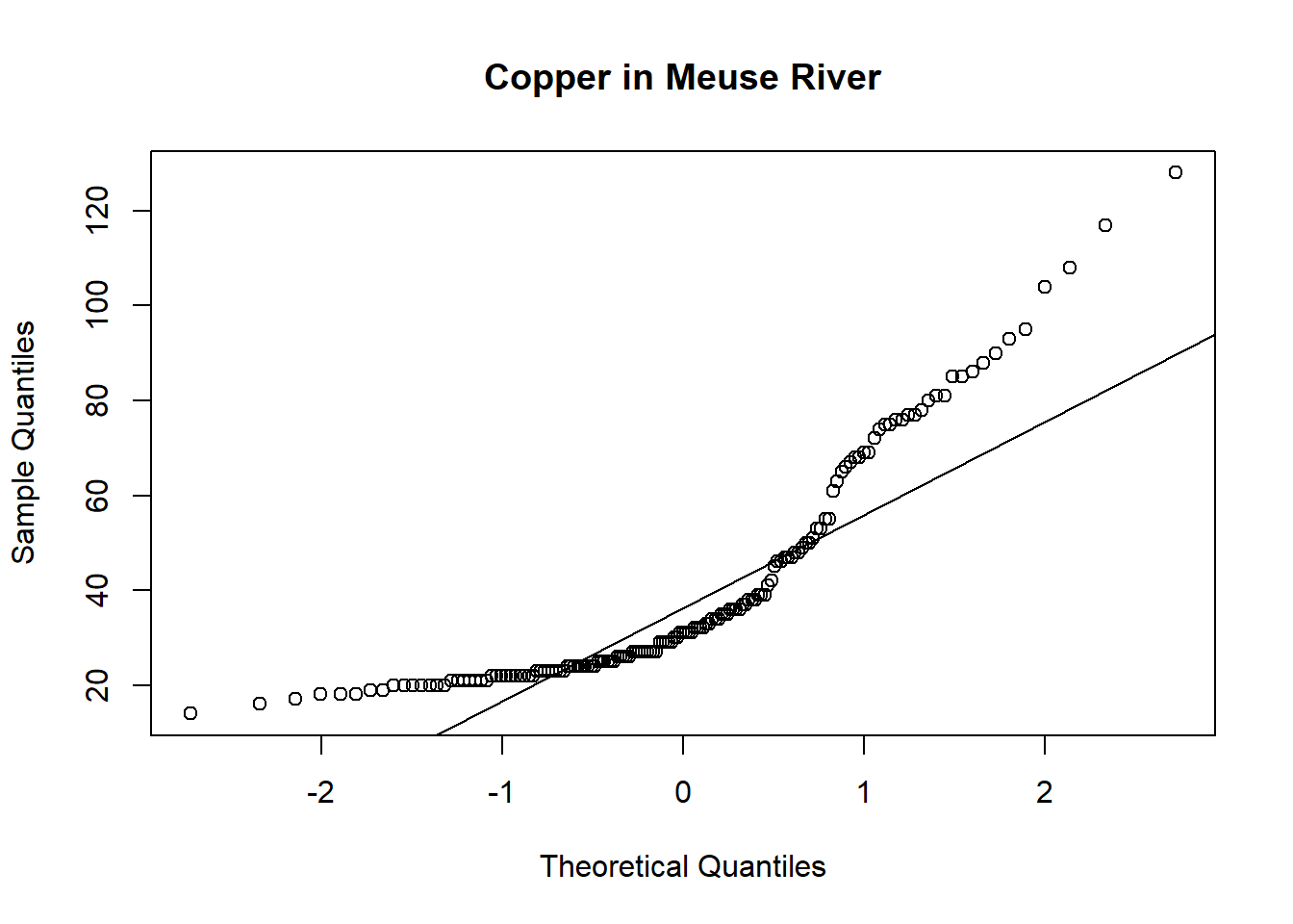
Exploring spatial trend
Spatial exploratory data analysis starts with the plotting of maps with a measured variable.
coordinates(meuse) <- c("x", "y")
spplot(meuse, "zinc", do.log = T)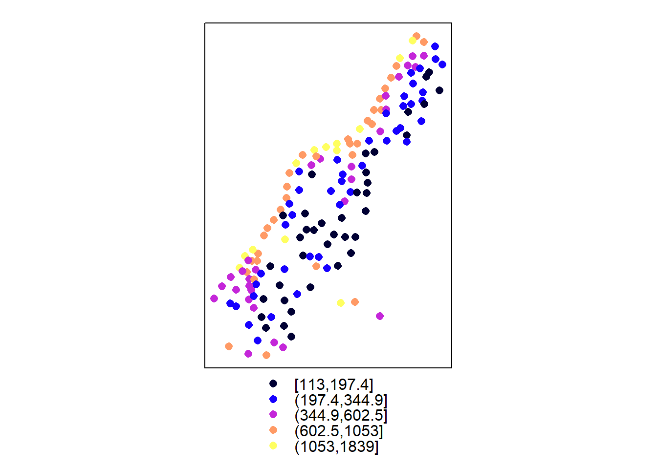
bubble(meuse, "zinc", do.log = T, key.space = "bottom")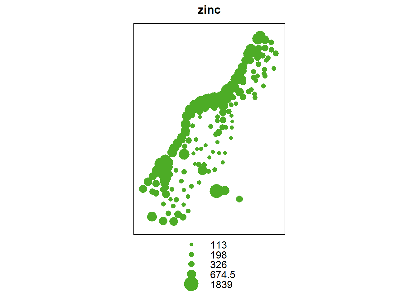
The evident structure here is that zinc concentration is larger close to the river Meuse banks.
In case of an evident spatial trend, such as the relation between top soil zinc concentration and distance (\(\text{zinc} \propto \beta_0 + \beta_1(\text{dist})\)) to the river, we make a plot to illustrate this relationship.
pacman::p_load(lattice)
xyplot(log(zinc) ~ sqrt(dist), as.data.frame(meuse))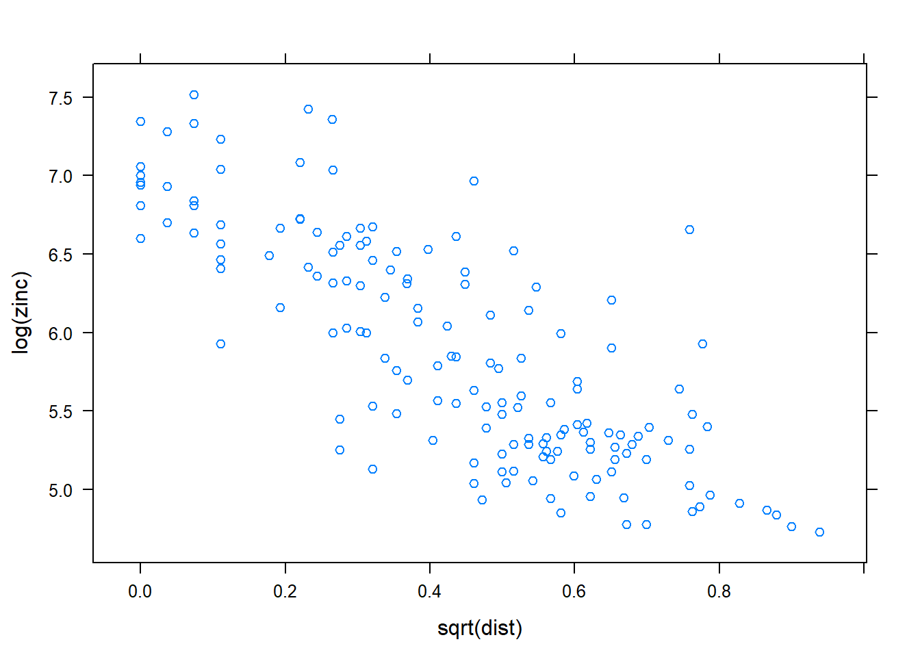
The plot shows that Zinc concentration linearly decreases with increasing distance from the river. This supports the former premise that heavy metal concentration is higher along the river banks.
We can also model this relationship using a linear regression and plot maps with fitted values and with residuals.
zn.lm <- lm(log(zinc) ~ sqrt(dist), meuse)
meuse$fitted.s <- predict(zn.lm, meuse) - mean(predict(zn.lm, meuse))
meuse$residuals <- residuals(zn.lm)
spplot(meuse, c("fitted.s", "residuals"))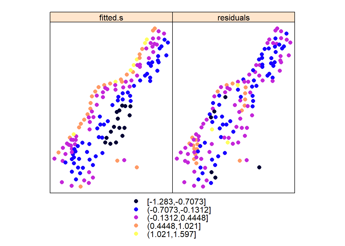
These plots reveal that although the trend removes a large part of the variability, the residuals do not appear to behave as spatially unstructured (spatially independent) or white noise. We see that residuals with a similar value occur regularly close to another. This indicates some degree of spatial dependency with distance. More analysis will take place when we further analyse these data in the context of geostatistical models; first we will go through simple, non-geostatistical interpolation approaches.
Let us first look at another example before we go to non-geostatistical interpolation. Here we use data from [Piikki et al.] 2019(https://www.mdpi.com/2071-1050/11/15/4038).
d <- read.csv("./data/soil_data_CIAT.csv", stringsAsFactors=FALSE)
knitr::kable(head(d, n=3), align = 'l')| LAB_ID | X | Y | Bulk_density | Carbon | Clay | Sand |
|---|---|---|---|---|---|---|
| CT258-6711 | 714875 | 72875 | 1.454268 | 2.472 | 43.54774 | 40.47143 |
| CT258-6697 | 713625 | 73125 | 1.171974 | 2.298 | 51.57937 | 32.42703 |
| CT258-6797 | 706625 | 73375 | 1.398217 | 1.510 | 35.93126 | 54.07674 |
Examine the spatial trend of the variables (Bulk density, Carbon, Sand and Clay).
pacman::p_load(gridExtra)
coordinates(d) <- c("X", "Y")
plots = lapply(names(d)[2:5], function(.x) spplot(d,.x,do.log = T, main=.x))
do.call(grid.arrange, plots)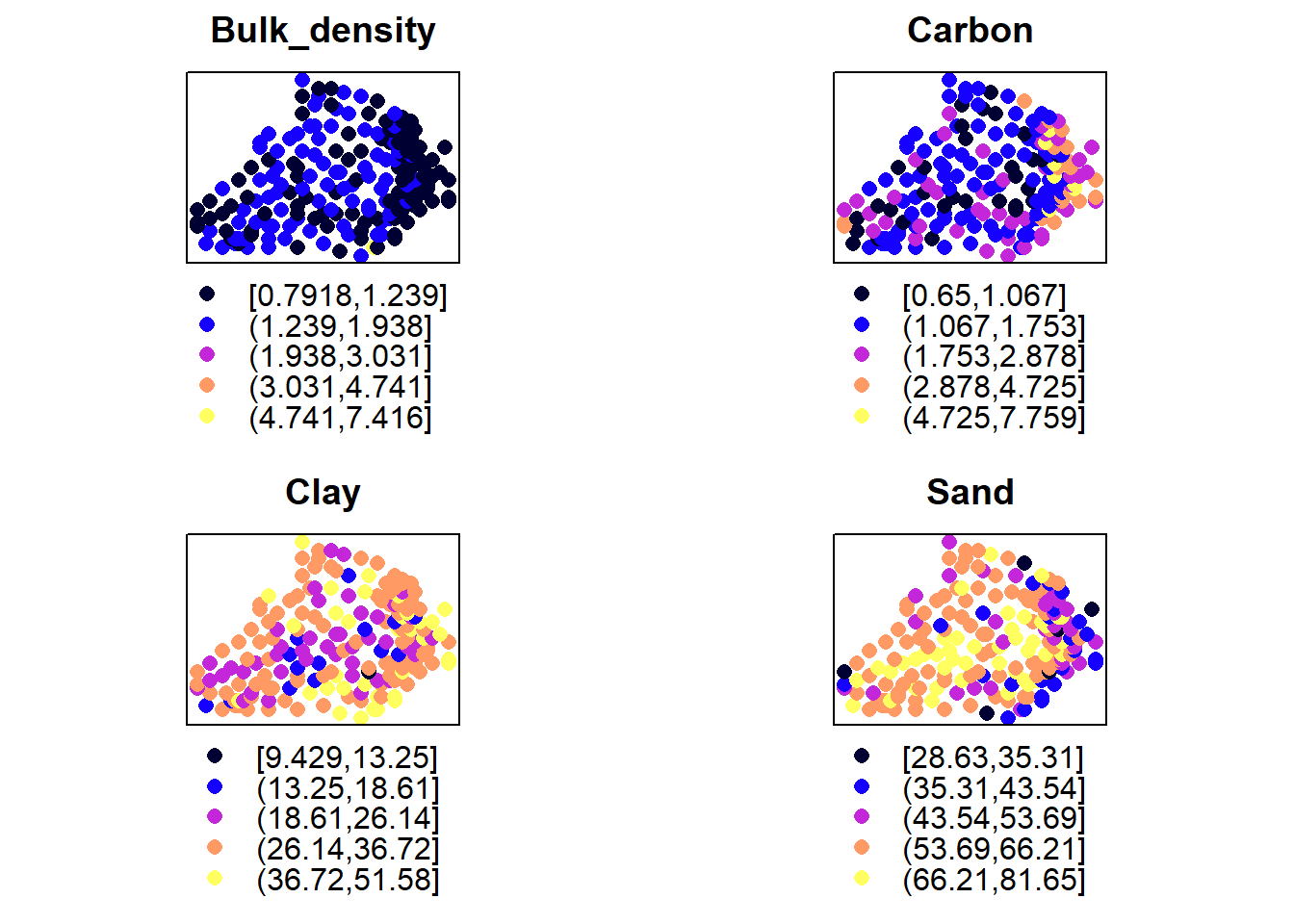
Its clear that there is some spatial structure in these variables. This is also supported by the trend depicted their residuals obtained by regressing the variables over their locations/coordinates:
#Carbon
ca_lm <- lm(Carbon ~ X + Y, d)
d$fitted.ca <- predict(ca_lm, d) - mean(predict(ca_lm, d))
d$residuals.ca <- residuals(ca_lm)
#Bulk density
bd_lm <- lm(Bulk_density ~ X + Y, d)
d$fitted.bd <- predict(bd_lm, d) - mean(predict(bd_lm, d))
d$residuals.bd <- residuals(bd_lm)
#sand
sa_lm <- lm(Sand ~ X + Y, d)
d$fitted.sa <- predict(sa_lm, d) - mean(predict(sa_lm, d))
d$residuals.sa <- residuals(sa_lm)
spplot(d, names(d)[6:11])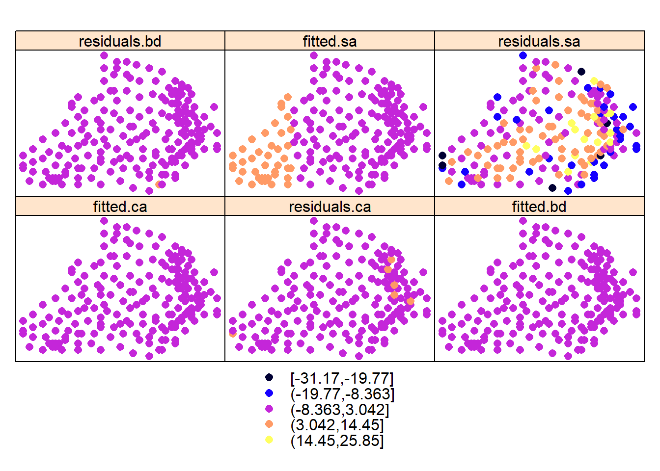
#plots = lapply(names(d)[6:11], function(.x) spplot(d,.x, main=.x))
#do.call(grid.arrange, plots)
Is there any relationship between organic carbon with clay and sand?
par(mfrow=c(1,2))
plot(Carbon ~ Clay + Sand , d)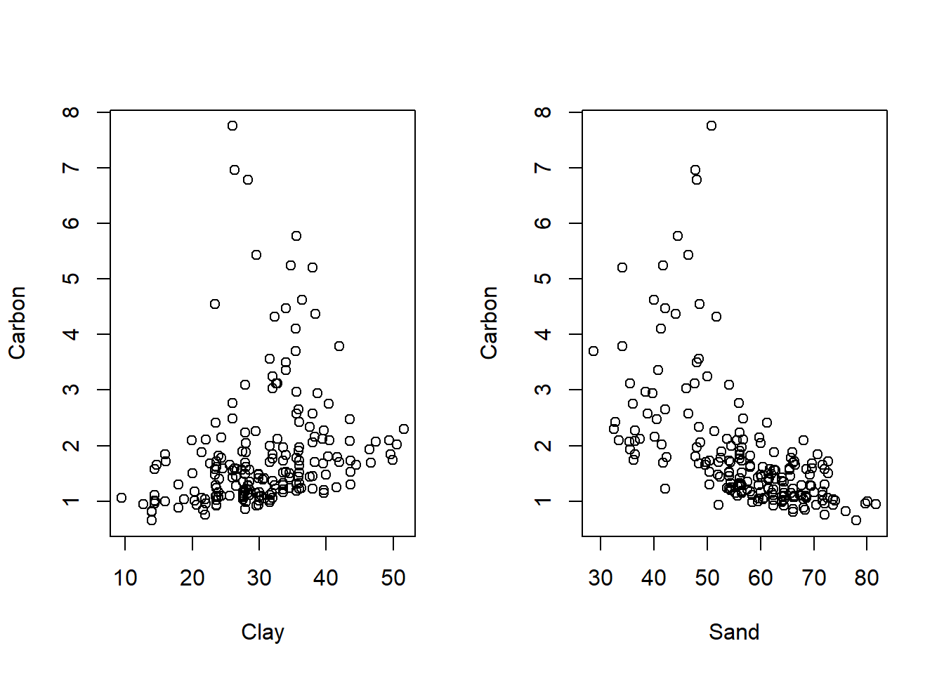
We have seen how to explore data using plots and some measures. Next lesson illustrates how to analyze the data using non-geostatistical interpolation.
References
Piikki, K.; Söderström, M.; Sommer, R.; Da Silva, M.; Munialo, S.; Abera, W. A Boundary Plane Approach to Map Hotspots for Achievable Soil Carbon Sequestration and Soil Fertility Improvement. Sustainability 2019, 11, 4038.